Getting bored with the plots you can make using the base R plot? Probably time to spice things up with ggplot!
You can read through this article, or you can watch the tutorial video below (or both!).
Let’s get started. First load the ggplot2 library, since thats what we’re here to learn!
library(ggplot2)We’re going to be looking at the msleep dataset (same one we were looking at in the last tutorial )
sleep <- ggplot2::msleepWe’re interested in exploring the linear relationship between log(brain weights) and total sleep. In light of this, let’s make a new data.frame for those pieces of data.
data <- data.frame(log_bw=log(sleep$brainwt), st=sleep$sleep_total)
summary(data)
## log_bw st
## Min. :-8.874 Min. : 1.90
## 1st Qu.:-5.845 1st Qu.: 7.85
## Median :-4.390 Median :10.10
## Mean :-4.063 Mean :10.43
## 3rd Qu.:-2.085 3rd Qu.:13.75
## Max. : 1.743 Max. :19.90
## NA's :27As you can see from the summary, there are missing (NA) values in log_bw. Let’s get rid of those using the which() function.
data_clean <- data[which(!is.na(data$log_bw)),]
summary(data_clean)
## log_bw st
## Min. :-8.874 Min. : 2.900
## 1st Qu.:-5.845 1st Qu.: 7.575
## Median :-4.390 Median : 9.950
## Mean :-4.063 Mean :10.171
## 3rd Qu.:-2.085 3rd Qu.:12.575
## Max. : 1.743 Max. :19.900Now the summary shows that we have no missing values, let’s move on. Let’s print a quick scatter plot of the data (just like we did in the previous tutorial). The only new thing here is the call to theme_bw(). This is an example of using themes to change the general feel of the plot. Play around with other themes or even create your own!
g1 <- ggplot(data=data_clean) +
  geom_point(aes(x = st, y = log_bw)) +
  theme_bw()
g1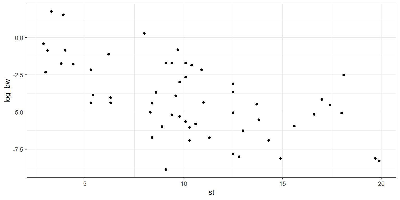
You can see that there is some linear trend in the plot, and a linear regression may be appropriate to fit a “best fit” line. We will use the function lm(), which performs an ordinary least squares regression. In this case we have log_bw as our dependent (response) variable, and st as our independent variable. Note that the “+ 0” indicates that we do not want an intercept term in our regression (so the intercept is forced to be the point (0,0)). This choice was made arbitrarily, and in a real analysis you would need to worry about justifying that choice.
mod1 <- lm(formula = log_bw ~ st + 0, data = data_clean)
s <- summary(mod1)
Let’s take the output from the linear regression, and put it into a data.frame so that we can use it easily with ggplot.
data_mod1 <- data.frame(x = mod1$model$st, y_fit = mod1$fitted.values)Now we can easy add the regression line to our scatter plot!
g2 <- g1 + geom_line(data   = data_mod1, aes(x = x, y = y_fit),
                     colour = "blue",
                     size   = 1)
g2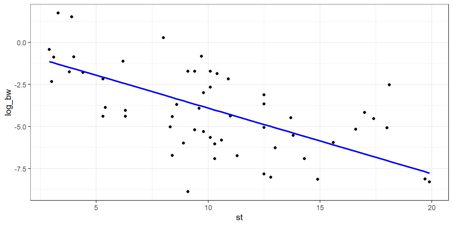
Adding standard error lines is very similar, and we’ll make use of the standard error already calculated and stored in the model summary. We’ll set the geom_point to have an alpha of 0.5, this will allow the points to fade into the backdrop, and bring out the regression line, which we want to be the visual focus of the plot. We will also use linetype = 2 in order to allow the standard error lines to have a dashed style.
sigma <- s$sigma

g3 <- ggplot() +
  geom_point(data    = data_clean, aes(x = st, y = log_bw),
             alpha   = 0.5) +
  geom_line(data     = data_mod1, aes(x = x, y = y_fit),
            size     = 1,
            colour   = "blue") +
  geom_line(data     = data_mod1, aes(x = x, y = y_fit-sigma),
            colour   = "blue",
            linetype = 2) +
  geom_line(data     = data_mod1, aes(x = x, y = y_fit+sigma),
            colour   = "blue",
            linetype = 2) +
  theme_bw()
g3
Next up we’ll look at the outliers! There is some flexibility in defining outliers, so for our purposes we will define an outlier to be any point greater than 2 standard errors from the fitted line.
data_outs <- mod1$model[which(abs(mod1$model$log_bw-mod1$fitted.values) > 2*sigma),]
data_outs
## log_bw st
## 17 -8.873868 9.1
## 62 -2.513306 18.1You can see that we have two outliers, let’s highlight them on our plot in bright red.
g4 <- g3 + geom_point(data   = data_outs, aes(x = st, y = log_bw),
                      colour = "red",
                      size   = 2.25)
g4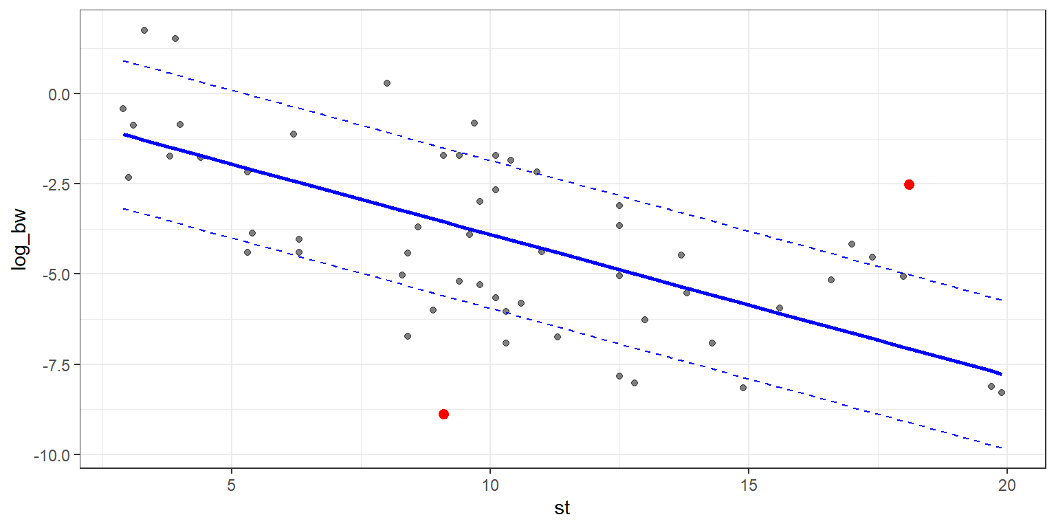
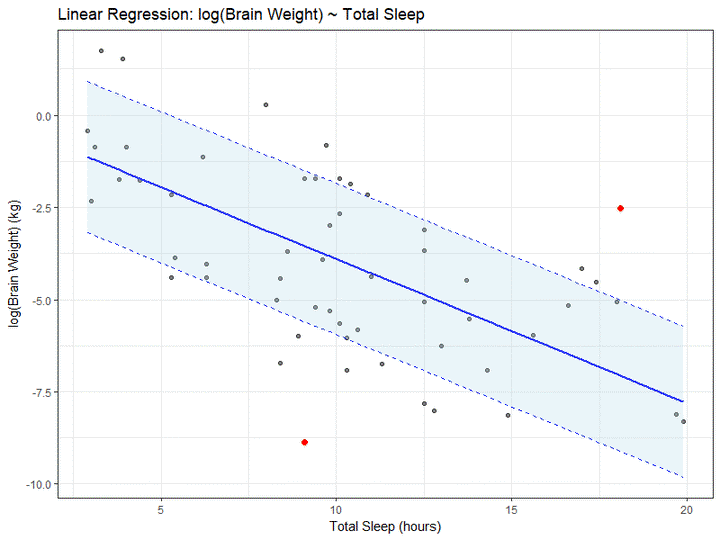
Let’s shade in the region between the standard error lines, purely for the joy of shading areas of a plot. We’ll do this using geom_ribbon, and while we’re at it we’ll add prettier labels and a plot title.
g4 + geom_ribbon(data  = data_mod1, aes(x   = x,
                                       ymin = y_fit-sigma,
                                       ymax = y_fit+sigma),
                 alpha = 0.25,
                 fill  = "lightblue") +
  ggtitle("Linear Regression: log(Brain Weight) ~ Total Sleep") +
  xlab("Total Sleep (hours)") +
  ylab("log(Brain Weight) (kg)")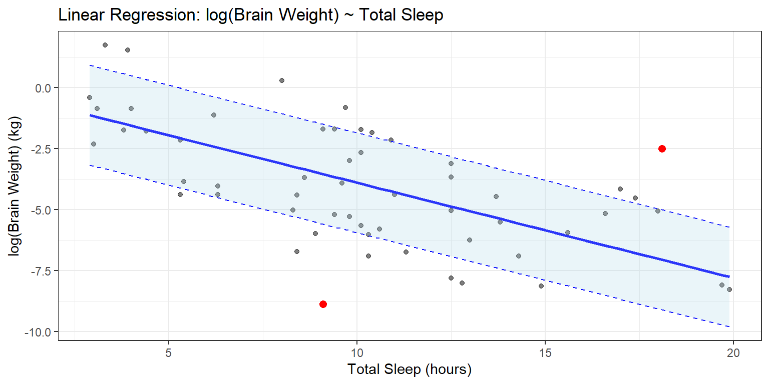
That concludes this tutorial lesson on ggplot2. Now go make some beautiful graphs! Feel free to tweet them @mrparker9090.